Man,
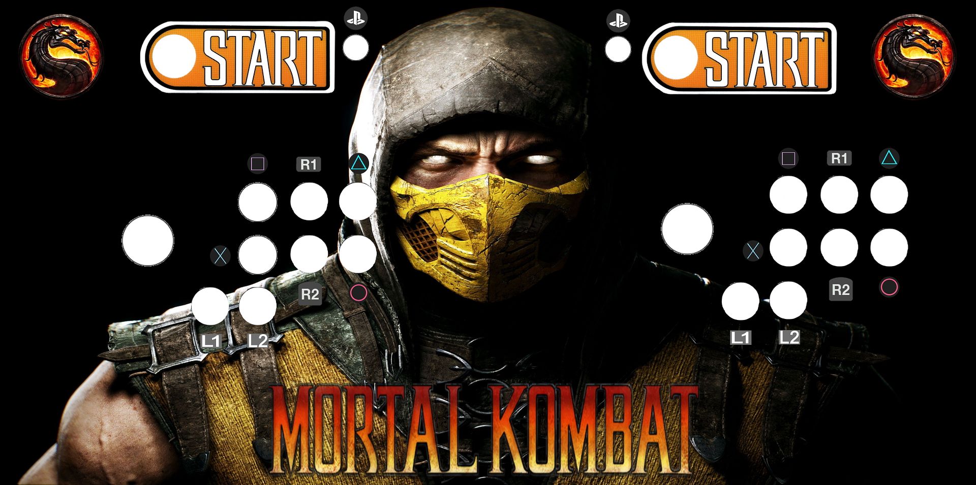
I like it, just not for an MK Machine.....when i think MK i dont think Dojo and bamboo.
Im not trying to be ugly, but i dont know why you insist on cluttering up design with un-needed graphics.....swords and green bamboo
Take the logo, and the mortal kombat off, and you'd never know this is an MK9 cab, it would look like some generic knockoff of martial arts game.
This is the best one i think........with the changes recommended prior (facing the dragons right, using your current starts, and removing the button labels)

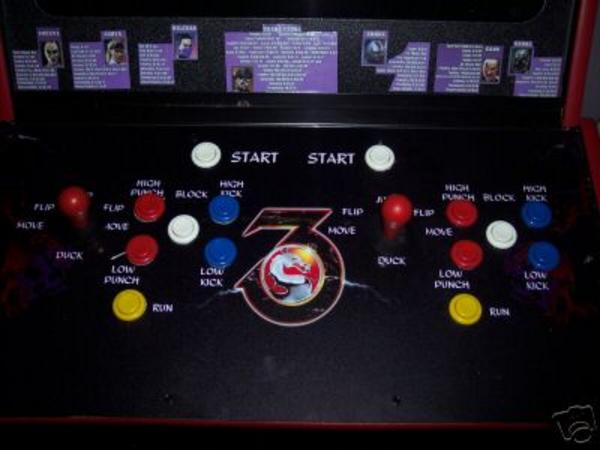
Remove the Mortal Kombat, replace it with a "9" or an 'IV", Like below, but more in scorpions Neck/Chest Cavity.

If you make the 9 right you could put something coo` in the oval portion of the number....like the netherealm logo etc.
I would take the swords, out, , this keeps your linear flow of the design in tact. You have alot or horizontal and vertical lines, then you mixed in the crossed swords, which makes them visually seem out of place.
If i had to use them i would of put them underneath each player controls blades facing each other, 9 in the middle, used a blood font and had mortal dripping from one blade and kombat dripping from the other
But that's just me


 Home
Home Help
Help Search
 Login
Login Register
 Send this topic
 Print
Print


