Main Restorations Software Audio/Jukebox/MP3 Everything Else Buy/Sell/Trade
Project Announcements Monitor/Video GroovyMAME Merit/JVL Touchscreen Meet Up Retail Vendors
Driving & Racing Woodworking Software Support Forums Consoles Project Arcade Reviews
Automated Projects Artwork Frontend Support Forums Pinball Forum Discussion Old Boards
Raspberry Pi & Dev Board controls.dat Linux Miscellaneous Arcade Wiki Discussion Old Archives
Lightguns Arcade1Up Try the site in https mode Site News

Unread posts | New Replies | Recent posts | Rules | Chatroom | Wiki | File Repository | RSS | Submit news


Author Topic: Which galaga artwork is correct  (Read 6596 times)

0 Members and 1 Guest are viewing this topic.

crashwg

  • Trade Count: (+10)
  • Full Member
  • ***
  • Offline Offline
  • Posts: 3076
  • Last login:May 24, 2019, 11:01:05 am
Which galaga artwork is correct
« on: March 08, 2004, 03:02:12 am »
I'm currently trying to get together a full collection of galaga artwork and I noticed that there are two versions of the sideart out there.  One from patrickl and one from muhati.

I noticed that the colors seem to be a little bit darker in muhati's version and strangly enough the left eye of the bug (is it a bug?) is a different color than the rest of the red in the sideart.  While muhati uses 216R/5G/24B and patrickl uses just 255R...  Is one more accurate than the other?  On top of that the only marquee I've found is by zorg, and I haven't even looked at the colors of that, but I'm sure they're different too.

On one hand I prefer the darker muhati version, but on the other hand patrickl has done a full set of artwork and they are all color matched to eachother.
Is there a way that I can easily convert patrickl's kickplate and cp overlay and zorg's marquee to the same colors as the muhati sideart?  That is of course unless patrickl's set is the more correct version compared to the original...  I don't know, all I want is to have artwork, as close to original as posible and all matching eachother.
If there's bees in the trap I'm catching em
By the thorax and abdomen
And sanding the stingers down to a rough quill
Then I dip em in ink, and I scribble a bit
But if it they wriggle then I tickle em until they hold still
Lemme say it again
In my land of pretend
I use bees as a mf'n pen

zorg

  • Trade Count: (0)
  • Full Member
  • ***
  • Offline Offline
  • Posts: 1102
  • Last login:May 19, 2022, 09:00:38 am
Re:Which galaga artwork is correct
« Reply #1 on: March 08, 2004, 03:33:18 am »
I guess the colors on my marquee are different ;-)

at the time of vectorizing I  didn't have accces to a real one. I just do some eye color matching  ;)

I can convert the colors to the one used by patrickl's or muhati

tell me and I do ;)

I'm on the planning stage

patrickl

  • I cannot know for certain which will be tastiest
  • Trade Count: (+2)
  • Full Member
  • ***
  • Offline Offline
  • Posts: 4614
  • Last login:August 27, 2021, 09:25:30 am
  • Yo momma llama
    • PocketGalaga
Re:Which galaga artwork is correct
« Reply #2 on: March 08, 2004, 06:02:52 am »
As I say in the description of th sideart (in the Illustrator file), I'm not sure of the colors, but I doubt 3dmacman or Zorg (the original authors of the other sideart version and not mahuti) knew which colors were accurate. There are actually different color schemes used. I have collected dozens of sideart pictures and there seem to be 2 color schemes. The original one (on the old and damaged cabinets) and a new one (taken from restored cabinets). Apparently Twobits does not use the original colors, or the original paint changes color over time. This is most apparent in the dark green areas in the ribbon on the sideart. In the original artwork you can see clear dark patches, but the restored artwork hardly shows these. The logo seems to be out of one color too in the restored artwork.

I redid the sideart because the baseimage 3dmacman and Zorg used was very hard to use and at some points incorrect. The colors are too dark (especially compared to the original artwork), the image is warped (bottom is skewed to one side and is tapered inward) and the top logo is taken from the flyer instead of from the sideart (with stars inside the logo). The bitmap baseimage was apparently worked on a lot thereby damaging it's use for vectorizing. Also the images I used where much higher res, so I guess there will be some more detail in there as well. On the other hand, the artwork I used is from a "class of 81" and allthough I tried to correct differences between them, there might be small differences to the original. But all in all I feel my version will be more accurate ;D

If you have Illustrator (or download a 1 month trial) you can easily change the colors though. Just click on an item of the color you wish to change. The corresponding "color swatch" is then selected on the right (or just click on the appropriate colorswatch yourself). There is a seperate swatch for outline and for fill. Change it's color and all items with that color are changed. Now that I look at it again I see I uploaded the wrong file. I'd go for something like RGB 32 255 64 (the sideart green has a greater blue component than red, the green on the CPO does not). I used this reddish color to get something the correct color from my printer. Must have forgotten to restore the color before uploading. Actually the purple was a bit too light too (I suggest using 128, 112, 220). Will try to correct that on the library.

The Kickplate I did was based on the same colors I used in the sideart. The colors used in the CPO, are different and those in the marquee are different as well. Looking at pictures of cabinets these colors would be different on actual cabs too. So, the pieces of artwork do not seem to be colormatched on a real cabinet (well the kickplate and sideart are, but the rest isn't).

Here are two images that will hopefully explain better what I tried in words:


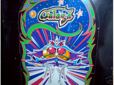
Picture of the original sideart. BTW this picture is not very good so don't use the colors off this, but it shows the difference between dark and light green very well.

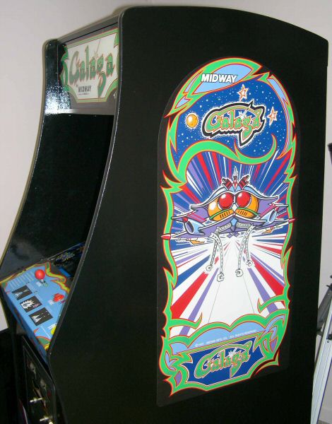
picture of a Galaxian cabinet converted (or as the seller claimed, restored) to Galaga. The latter shows only one green color (if you look real hard you can see the slightly darker green though) and you can clearly see the green on the CPO is way different from the sideart. And then again the marqee has different colors again. Allthough the marquee green seems to look like the sideart green.
« Last Edit: September 13, 2004, 04:12:27 am by patrickl »
This signature is intentionally left blank

crashwg

  • Trade Count: (+10)
  • Full Member
  • ***
  • Offline Offline
  • Posts: 3076
  • Last login:May 24, 2019, 11:01:05 am
Re:Which galaga artwork is correct
« Reply #3 on: March 08, 2004, 10:25:40 pm »
If one had access to a galaga cab, is there some way to accurately find out what the color is?  I suppose if someone had the sideart not attached to a cab you could bring it to homedepot and use there color matching machine, but I'm looking for a more portable way of accurately getting color matches.
If there's bees in the trap I'm catching em
By the thorax and abdomen
And sanding the stingers down to a rough quill
Then I dip em in ink, and I scribble a bit
But if it they wriggle then I tickle em until they hold still
Lemme say it again
In my land of pretend
I use bees as a mf'n pen

mahuti

  • Wiki Master
  • Trade Count: (0)
  • Full Member
  • *****
  • Offline Offline
  • Posts: 2757
  • Last login:September 18, 2024, 01:16:22 pm
  • I dare anything! I am Skeletor!
Re:Which galaga artwork is correct
« Reply #4 on: March 09, 2004, 12:25:10 am »
Paint swatches from any kind of paint supplier
« Last Edit: March 09, 2004, 12:25:44 am by mahuti »
Raspberry Pi, AttractMode, and Skeletor enthusiast.

crashwg

  • Trade Count: (+10)
  • Full Member
  • ***
  • Offline Offline
  • Posts: 3076
  • Last login:May 24, 2019, 11:01:05 am
Re:Which galaga artwork is correct
« Reply #5 on: March 09, 2004, 12:40:32 am »
Duh, I should have thought of that  :P
If there's bees in the trap I'm catching em
By the thorax and abdomen
And sanding the stingers down to a rough quill
Then I dip em in ink, and I scribble a bit
But if it they wriggle then I tickle em until they hold still
Lemme say it again
In my land of pretend
I use bees as a mf'n pen

patrickl

  • I cannot know for certain which will be tastiest
  • Trade Count: (+2)
  • Full Member
  • ***
  • Offline Offline
  • Posts: 4614
  • Last login:August 27, 2021, 09:25:30 am
  • Yo momma llama
    • PocketGalaga
Re:Which galaga artwork is correct
« Reply #6 on: March 09, 2004, 04:21:17 am »
If the color is really important to you (and you like the Twobits coloring)  then you might as well buy the real thing. Twobits sells all the artwork and it's silkscreened so it will look better than a regular print too. If not, then just select colors you like (or think that are appropriate) It's quite easy to change the colors in an Illustrator image. Allthough it's not that easy to get a set of colors that together look right.

As I said, I have collected dozens of pictures of ebay auctions and there seem to be a lot of different colors used on these things. The Twobits reproductions seem quite stable in colors, but the original ones really vary wildly in the colors used. I have gone for an approximation of the original colors (which are lighter and brighter than the Twobits colors)
This signature is intentionally left blank

Stingray

  • Official Slacker - I promise to try a lot less
  • Trade Count: (+2)
  • Full Member
  • ***
  • Offline Offline
  • Posts: 10463
  • Last login:April 08, 2021, 03:43:54 pm
Re:Which galaga artwork is correct
« Reply #7 on: March 09, 2004, 08:51:30 am »
I've noticed the same thing on the Galaxian artwork. I've collected quite a few images and the colors seem to be at least slightly different, and in some cases, very different from one cab to the next. Like you said, it's no big deal to change the colors in an .ai file so there's really not much point in obsessing about the colors. The end user can change them to suit his particular application if needed.

-S
Stingray you magnificent bastard!
This place is dead lately.  Stingray scare everyone off?

crashwg

  • Trade Count: (+10)
  • Full Member
  • ***
  • Offline Offline
  • Posts: 3076
  • Last login:May 24, 2019, 11:01:05 am
Re:Which galaga artwork is correct
« Reply #8 on: March 10, 2004, 04:13:26 am »
I'd love to get it silkscreened but unfortunatly that would cost a butload for me, due to the fact that I'm making a mini galaga, but thanks for the suggestion patrickl.  I guess I'm going to have to spend the time to get all the colors the way I want them  :-\ bummer.  Gonna have to go get one of those color matching things at homedepot and head down to funspot...  I sure hope they don't mind me acting like I'm crazy, all studying and taking pictures of an arcade cabinet ::)
If there's bees in the trap I'm catching em
By the thorax and abdomen
And sanding the stingers down to a rough quill
Then I dip em in ink, and I scribble a bit
But if it they wriggle then I tickle em until they hold still
Lemme say it again
In my land of pretend
I use bees as a mf'n pen

patrickl

  • I cannot know for certain which will be tastiest
  • Trade Count: (+2)
  • Full Member
  • ***
  • Offline Offline
  • Posts: 4614
  • Last login:August 27, 2021, 09:25:30 am
  • Yo momma llama
    • PocketGalaga
Re:Which galaga artwork is correct
« Reply #9 on: March 10, 2004, 05:11:12 am »
He, he, yeah I got quite a lot of funny looks when I was taking pictures of the "Class of 81" cab. BTW, the colors of the Galaga sideart on Class of 81 are totally different again. I'll add a picture of it at the end.

If you do find a Galaga cab and are able to get the real colors off it please let us know. I'd love to correct the colors. Luckily there aren't that many colors on it. The greens are probably the most important.

I'm planning a slightly altered Galaga cabinet myself too, so I can't use the reproduction artwork either. It would have been a lot cheaper for me to just buy it instead of spending countless hours searching for pictures, straightening out the pctures and then tracing them. In fact I actually asked Twobits and they wouldn't send it to the Netherlands!

Personally I'm just gonna color match the artwork myself to some color scheme I like though. I have put all the artwork as is on my microcab and I have to say all the different color schemes together really look like a mess. Stingray's custum artwork looks much better. Maybe I'm even gonna do my own Galaga themed artwork too. The cab is probably gonna be made of cherry wood, so I guess red colored artwork would probably look better on it than a green+blue+purple combination.

BTW, if you're looking for the Galaga bezel. I'm drawing that one now. Well, I'm still working on straightening out all the pictiures General Zod kindly provided, but it should be done in a few weeks.

Picture of Class of 81 Galaga Sideart:
« Last Edit: September 13, 2004, 04:12:52 am by patrickl »
This signature is intentionally left blank