Here are a few quick ideas -- a starting point at least:


Keeping with on the same mindset as my canucks cabinet, "less is more" when it comes to sport logos. So I tried tastefully using the icons around the cabinet. IMO, a few logos would go a long way, so I threw the sharks main logo on the sides...and the SJ logo on the front for the CP.
I tried a solid teal cabinet , but it looked too boring and a bit hard on the eyes for this cabinet shape. All black looks "ok", but again, a bit too mundane. So I tried the two tone look, which I think is working better.
The black sides, and teal front parts is my favourite out of the three.
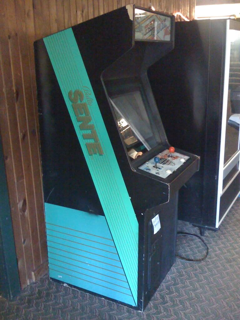
Kinda reminds me of the old (and rare) Sente cabinets:

This one is Hat Trick, one of the greatest hockey arcade games ever (if played with 2 players -- vs cpu kinda blows)
Also note, I tried throwing the jersey lines at the bottom of the side art, like the front section, but it didn't look "exciting enough", and because this is a full size cabinet the top area looked too barren. So instead, I have the lines going slanted and passing behind the logo. I think it works well.
The nice thing about my cocktail cabinet is that it's a small unit, so sport themed cabinets can be easy to conceptualize. For a full size cabinet, you gotta put a bit more effort into not making the cabinet look cheesy.
I think these examples are a good starting point. Let me know what you think.


 Home
Home Help
Help Search
 Login
Login Register
 Send this topic
 Print
Print


