OK, after some tough Googling...lol. I found these files and got the hack to work in MAME. If I wanted this to work on a real arcade with a PCB, I'd need to burn 5 IC chips and replace them on the board correct?
You probably won't need to burn all of them.
Compare the hash on each "asteroid.zip" file to the hash of the corresponding "asteroid6.zip" file.
- If the hashes match, that ROM was not modified for the hack ==> no need to burn a replacement.
- Pretty sure the file named "asteroid6.h2" is "035144-04e.h2"and "asteroid6.ef2" is "035145-04e.ef2"
It looks like your ROMs don't have labels on them.
- Before you burn a replacement ROM, read the old one to confirm which one it actually is.
- You may want to label them with the ROM and Revision numbers/hack name for future reference.
Problem, I don't have sockets for H2 and J2....hmmm, I'm not exactly sure which ones to replace besides 035143-02. But even that one seems to be in the wrong spot...
You have a 034986-02 PCB so the locations are a bit different than originally anticipated.
If you look at your
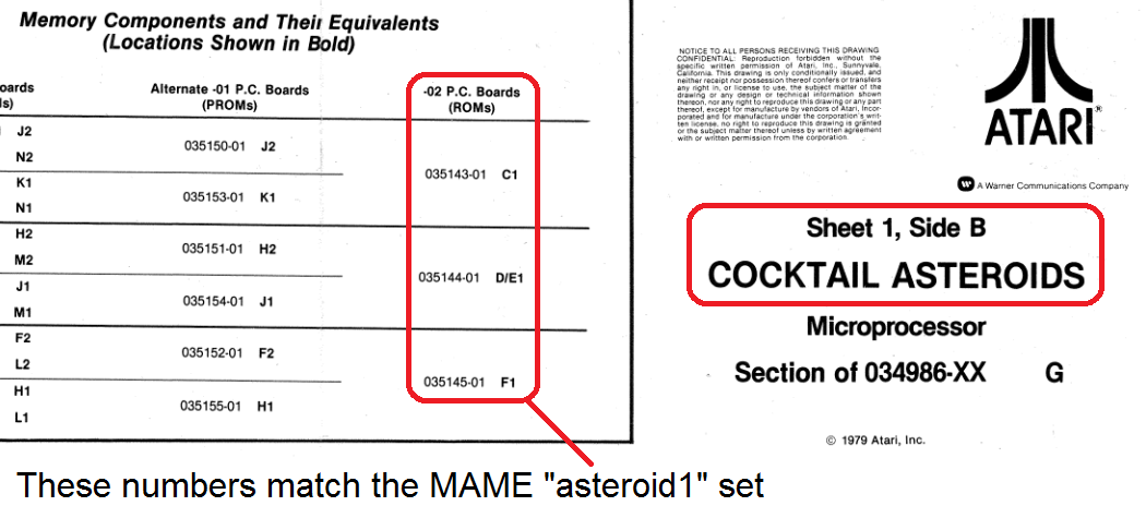
Sheet 1, Side B schematic, you'll find this section that shows that there are a different number of chips and different locations on the -01 and -02 boards.
- Looks like the PROMs at
J2+K1 combine into the 035143 ROM located at C1 on your board.
- Looks like the PROMs at
H2+J1 combine into the 035144 ROM located at DE1 on your board.
- Looks like the PROMs at F2+H1 combine into the 035145 ROM located at F1 on your board.

Scott


 Home
Home Help
Help Search
 Login
Login Register

 Recent Posts


