DISCLAIMER: This game was born as a beautiful dedicated Centipede in 1981. At some time during it's life, some operator painted it black, replaced the wiring with a JAMMA harness, new power supply and evidently turned it into a Street Fighter II. After that, it was turned into a Mortal Kombat. So, I didn't kill the Centipede, I'm just replacing the partial MK kit with my own stuff. The only original parts on this cabinet are the plywood and coin door.Actually, I do plan on converting it back into a Centipede when I move up in the world, get a bigger place and have room for dedicated games. But as it is I have a one room apartment, so MAME machines are the most efficient way to go.
Okay, this is my third MAME machine. The first one was a big six button Midway cabinet (Made for a dedicated Killer Instinct actually) with a 25" monitor and an Xbox in it, really nice for fighting games. The second was a 3KOAM Z-back cabinet with a 25" vertical monitor, for shooters and other vertical games as well. Now, I could use the Midway cabinet for most of the games that I play. But the size of it, the 25" screen, games like Bad Dudes and Golden Axe, classics like Robotron, etc. Just didn't feel right on that thing. A smaller cabinet with a smaller monitor would feel closer to the original machines. Plus, using a PC instead of an Xbox would have more versatility. Oh, and I just wanted another machine in the room.

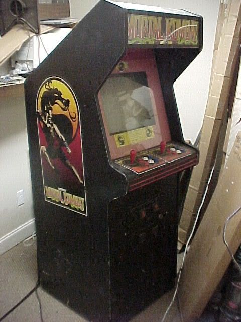
This was a Mortal Kombat conversion job I bought from a fellow Digital Press regular, in "the great $99 coin-op sale". He was cool enough to swap the board with an original Capcom SF2CE,which I've been meaning to get, and for an extra $50.00 he swapped the monitor for a 19" 1982 Electrohome G07. It has an incredible picture for such an old monitor, I was floored when I saw it.
I just love the shape and profile of the old Atari cabinets! They're so... arcadey... As much as I love them I wasn't planning on using one for my next MAME cabinet. The only way to do that is to get one that's already been converted, and I wasn't counting on that. So, I was thrilled when this opportunity came up- I get an Atari cabinet, a new control panel that's already drilled the way I want it, and no classic conversion blood on my hands!
When I make a MAME cabinet, the first thing I worry about is the art. I had a concept in mind, but I was thinking it'd be on some generic Dynamo. Having an Atari cabinet changed things, not only did the art have to be something generic enough to allow a wide range of genres to seem at home (Playing a ninja game on a cabinet with spaceships all over it would be wrong!) but I also had to come up with a design that would seem fitting for an Atari cabinet. Something that looked like 1982, but still flexible.
Nobody calls their machines "MAME" anymore. They give it a unique name, and outfit it with some kind of theme, usually ones that I don't think belong on a video game. Like sports teams, a movie license, What kind of theme will I go with? My Capcom six-button fighter machine has a Capcom theme, my vertical shooter cabinet is called "Danmaku" (a shmup genre) with a spaceship theme, but this machine is for a wide range of video games... hey, that's a good theme! Video games! Now, I need a title that says "video games"... ... the FINAL BOSS. Naaah. POWER UP! ...naah. All Your Base Are Belong To Us? No. I was playing Super Mario Bros. one day and it hit me-

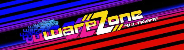
WARP ZONE! That's a cool name for a video game machine,
Warp Zone, like "Now entering WARP ZONE, the land of video games!" There's even a visual theme with that, I decided to make art that resembled some sort of generic video game world.
As I worked on the design, the classic nature of the Atari cabinet drove me to a retro look. I started with the bezel, because it's like the centerpiece, and I would design the marquee and CPO after it. I wanted it to look like a video game world, and after a month or so of rejecting other ideas, here's something I came up with- (Note how the borders on the bezel mimic the Centipede bezel)
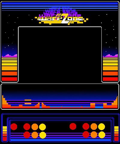
I thought it was rather fitting for a classic machine, and I liked the little 8-bit video game stage on the bezel, which was also going on the front part of the control panel. But after doing a mock-up on a picture of the Mortal Kombat, It just wasn't doing it for me. It's rather cartoony, and it was just too dang colorful; games like Double Dragon and Ninja Spirit would seem out of place to me. So I wanted something a bit more monotone, and in the end the 8-bit stuff had to go. It was too hard to make something that really strikes me with that motif. So I stuck with the same basic design, the horizontal lines, and made a red/black scheme, with a little blue to accent it. I threw in some stars and a blue glow on the horizon in the lower section to make it look like the landscape of another world. I think it's a more flexible design than the 8-bit mountains.
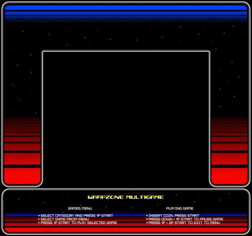
I feel a lot better with this design, it has a little more sophistication than the last one. Present-day fighting games, space games, swords & sorcery kind of games, they all fit well with this theme.
Now we need a control panel! Actually, one thing that influenced the new design was Nintendo's Playchoice 10 control panel. It's a cool design, and I think it's good for a multigame theme. After designing the bezel it was easy to come up with an effective CPO. Right away I imagined this control panel with red balltop Sanwa joysticks, with the chrome shaft. And shiny new Happs buttons! At first I'd cluttered it up with borders and lettering, but in the end I decided to keep it simple-
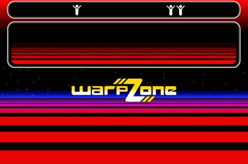
I think it's pretty effective. The only additional graphics here are the little "Atari start people", just a little nod to the original machine. The middle of the CP has the "Warp Zone horizon" graphics, and I made the logo using a lowercase Transformers font, modified a little bit.
And to top it all off, the marquee! The overall design is dark, and I hate black marquees. But I think this one is colorful enough to work out, I took the same basic design and tilted it for a nice dynamic effect. I added an image trail to the logo, like it's "flying through the warp zone!"
When I put it all together in a mockup, I really liked it. It has sort of a retro look to compliment the classic nature of the Atari cabinet, but modern games will look right at home as well. And the "Warp Zone" title is not only a snazzy name, (Titles with a Z are always more dynamic, aren't they?) but drives home the whole point of "video games".
I spent a month or so designing the artwork, and now that I've come up with just the right theme, it was time to make the high res version and send it off to Scott at mamemarquees.com. Now that I've finally got that out of the way, it's time to tear up some hardware!
Part 2 coming soon!


 Home
Home Help
Help Search
 Login
Login Register

 Send this topic
 Print
Print Topic: "Welcome to Warp Zone!" (Read 7078 times)


